Let’s Color

colorpalette

One of the things I love most about Pinterest is that it brings the concept of the inspiration board to everyday people — not just artists and designers. I’ve been a massive fan of the inspiration board for years and love getting inspired for many things — from character development in a piece of nonfiction to party planning for a friend’s birthday — by creating mood, color, and concept boards.

As you plan your wedding, you might know automatically which colors speak to you and nail them down right away. I thought I had it all figured out — navy and pale pink — until I looked at all the inspiration I was gathering and realized I was way off. In addition to your pinning, which is ridiculously fun, I recommend making some actual mood boards to get you feeling inspired. Grab lovely images and scraps of fabric, ribbon and magazine pages — throw in an old selfie of you two, and so on. Roll up your sleeves and start working on a massive collage of what your wedding means to you. You might just find, as I did, that your perfect palette emerges.

You can also check out how mine developed on my personal wedding board, We Were Married By the Sea.

purplegreen

If you love lavender, seek inspiration photos that include deeper purples and other accents like the cream in this table setting. The lime flowers also call to mind multitonal greens, which can be worked in multiple different ways.

blackwhite

Love isn’t always a matter of black and white, but if your wedding will be, consider warming things up with gold or cooling off with silver. The subtle glow of coral-brown in the stairwell picture above could be inspiration for the perfect, complimentary flowers to fit your wedding day.

redhotpink

Don’t choose between red and pink — just find ways they can work together. This bold and super-sweet palette is rockin’ … and timeless in its own, wild way.

Images used in this post have been borrowed from Pinterest. Collages were created by Jensy.

Matchy-Matchy

Matching is such a tricky thing, right? You can take it too far and look like a fool, you can ignore it altogether and look either amazing or absolutely tragic… you can toe the line and still not know whether you’re getting it right or not. As weddings have this tradition of matchy-matchy tied right into them, I went kicking and screaming into ours with a different idea. As with my general approach to fashion, I decided I wanted the different elements of our nuptials to “relate,” not to match.

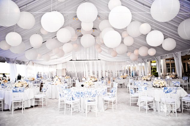
blue-and-white-wedding

white with blue. pretty!

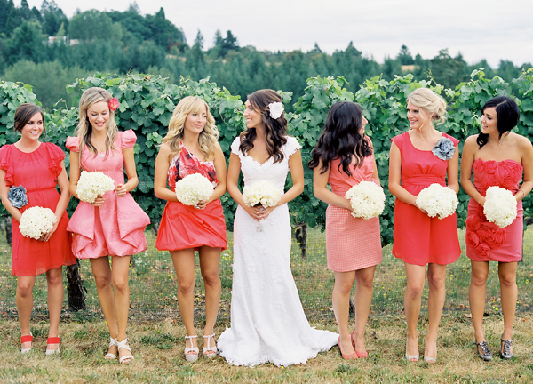
Hence followed five bridesmaids in five different dresses (styles and colors!), groomsmen wearing different ties, a candy table that bore no real correlation to our core palette but jazzed things up at the end of the night, and so on. When it comes to wedding coordination, how “by the books” are you? I’ve seen some one or two-hued affairs that are absolutely amazing. All-white with the subtlest pops of metallic or pastel? Sign me up. Bolder Autumn hues that coordinate gorgeously and complement a diverse range of skin tones? Yes, please. Black, white and gray? Not mad at that either.

coral-pink-bridesmaid-dresses

almost matchy-matchy, but not quite!

What was the coolest wedding color scheme you’ve seen recently? Or here’s another question for you… as a guest at someone else’s wedding, how much do you think/care about the colors? We will be rolling out tons of inspiration pages on colors in the coming months, and I am stirring my idea pot right now!

Colors!

The more you flip through bridal magazines, the clearer it becomes that there are millions of color palettes to choose from, and only one wedding to color-coordinate. Bummer! I love color, and I have a pretty clear idea of what I want, but if I could plan weddings for a living, damn would I have fun selecting palettes for other couples. I found my inspiration from fashion and lifestyle magazines. In fact, the swatches in my bridal binder are from an Oscar de la Renta dress, a bunch of balloons in a cool editorial spread, and a preppy fashion story I found in GQ.

We are going with navy and pale pink, my two favorite colors and a very generalized representation of the two of us. I wanted something soft and clean. He is a navy blue boy and I am pale pink through and through. I plan to use accents of white and either silver or gold. The jury is still out on which is better, but I have some time to figure that out. My advice when you pick your colors is to brainstorm about you and your betrothed. What are the colors you use in your home? What are you drawn to when shopping for clothing? What color is your favorite of his shirts? And then of course, there is the inevitable question: What color can you put your bridesmaids in without the threat of one of them taking a hit out on you?

An inspiration page I found online and popped right into the binder. Courtesy of nycweddings.com.

So, we decided on navy and pale pink. And, as promised, there will be tiny pops of bright pink. But if I were to plan weddings for others, here are some inspiration/ideas that I love for a show-stopping, unique palette:

Pure Gilt:

Totally glam, a gold wedding cake is a totally cool way to bring in modern technology for a Victorian look.

Green scene:

Lime green with salmon-hued accents is country-cute, and works for a bride who is not very girly.

Black & White and chic all over:

For the bold yet understated couple, this is a great color combo. It works for black tie weddings and can be toned down for a more casual affair.

Baby Blue:

A total crowd-pleaser, pale blue flatters most and creates a soft, romantic ambiance.

Pretty Purple:

Mix violets, lavenders and deep purples for a complex palette that is pleasing for all.